Blog 28

Louis Kahn again, I’m afraid folks – he is just such an interesting Modern architect. Unlike most of his contemporaries, much of his work is formal in its planning, often uses traditional materials and has a very obvious fascination with mass rather than transparency. He made no secret of his interest in the architecture of the past, whether it was the brick arches and concrete vaults of ancient Rome or the Euclidean geometry of its Renaissance palaces. He also, rather unusually, had a particular interest in the castles of Scotland, which proved to have a significant impact on his architecture.

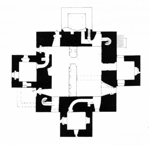
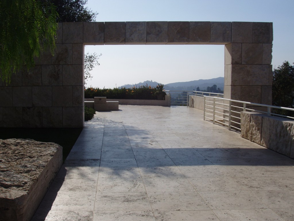
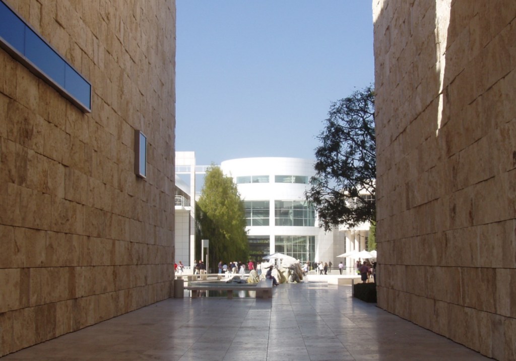
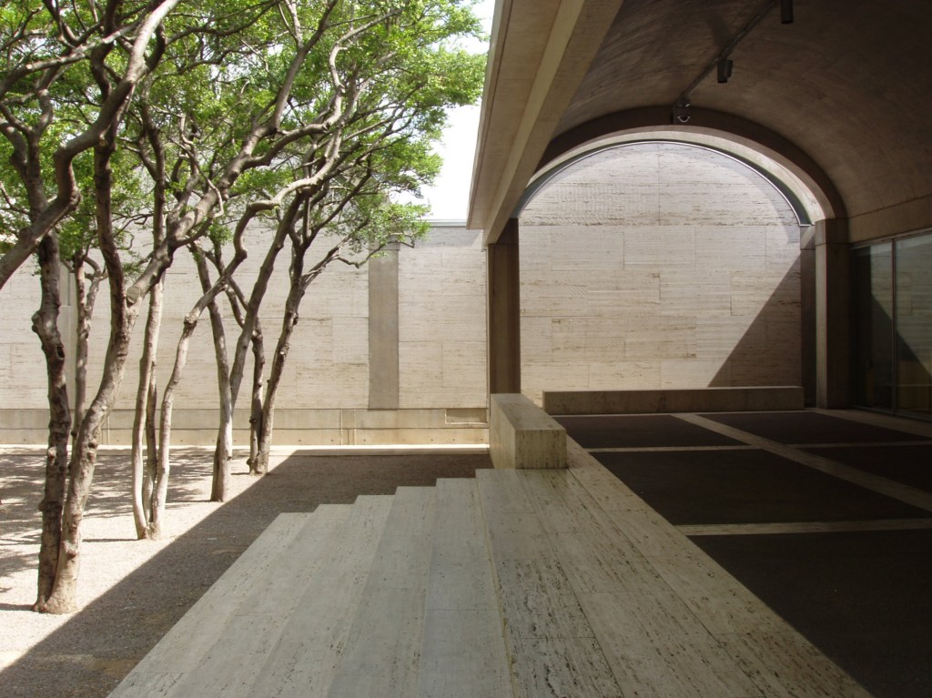
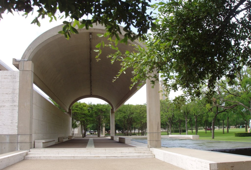
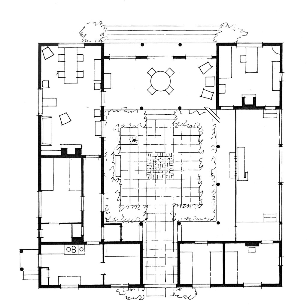
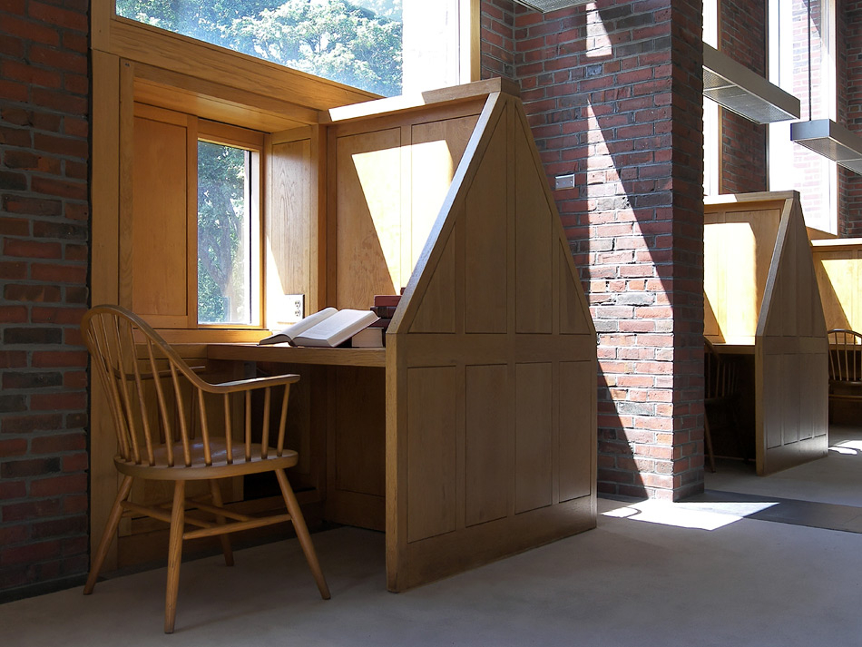
What fascinated Kahn was the great thick defensive stone walls of the castles and as their planning developed, the use of the wall, not just to enclose space in the centre of the castle, but also to be carved out to provide spaces within the thickness of the wall itself. He perceived this as a hierarchy of minor ‘servant’ spaces within the walls, which served the major spaces of the castles which the outer walls enclosed and protected, and he used this model again and again in his own work from his Richards Laboratories in Philadelphia to his Phillips Exeter Library (below).

Having then identified that the enclosing walls of a space could themselves provide a number of functions in addition to keeping the enemy out and letting light in, he started to use the depth of his external walls or screens to provide intimate, intermediate spaces on the very edges of his buildings, at the boundary between inside and out.

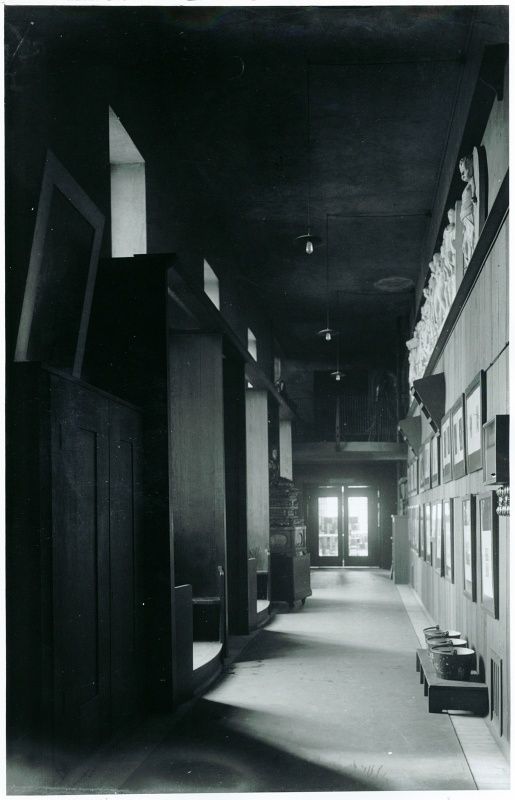
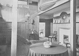
Interestingly, Charles Rennie Mackintosh, who had probably visited a few more Scottish castles than Louis Khan, also played a similar game in his houses and also in the delightful window seats which until recently enlivened one of the corridors in his magnificent Glasgow School of Art. The neat row of fire buckets also tell a tale….

If you don’t want to miss out on further blogs then please follow me on johngooldstewart.com

Blog 27

The loss of what has become known as “Sir John Soane’s Bank of England” has taken on almost mystical qualities amongst British architects. Nicholas Pevsner’s pronouncement (after the bank had already been rebuilt) that the demolitions constituted “the greatest architectural crime, in the City of London of the twentieth century” has stuck, and the architect responsible for the rebuilding – Sir Herbert Baker – has stood accused in the dock for almost a hundred years. Let’s look at a few of the facts.

Firstly, it was not “Soane’s Bank” but was a collection of toplit internal spaces and courtyards which had been created over two centuries by Soane, George Sampson, Robert Taylor and Charles Cockerell, with Soane having demolished much of his predecessors work to build his own. Secondly, the model of toplit, shallow-vaulted interior banking halls was already well established at the Bank, long before Soane arrived on site. Thirdly, neither Pevsner nor those who have blindly followed him in his criticism, have ever suggested how this rabbit warren of rooms and courtyards, which were no longer suitable to support the Bank’s activities nor even accommodate more than a third of their staff, should be preserved, on what is probably the most expensive piece of real estate in the UK and the historic base of the Bank’s activities.

Herbert Baker was appointed by the Bank to advise them on how best to redevelop their site (with Lutyens having already proposed total demolition). He immediately recognised the quality of many of the existing buildings and proposed not only that the great encircling wall which Soane had designed, should be saved in its entirety, but also that as many of the banking halls behind it as possible should be retained, with tall new buildings raised in the centre of the site and several floors of new accommodation below ground also created so that all the Bank’s activities could again be brought together on Threadneedle Street.

The Bank’s Court of Directors were divided between those who respected Baker’s advice to save as much as possible of the old Bank and those who wanted a completely new building like New York’s then recently completed Federal Reserve Bank. After several months deliberation, Baker was instructed to again consider complete demolition and he returned again proposing the retention of much of the old Bank, arguing that, due to rights of light, any new building would have to take a similar form, and on this occasion, he finally won majority support for his strategy.

So the truth is that we have Herbert Baker to thank both for saving so much of the old Bank and for producing a series of quite stunning spaces within the new building (all the images above are Baker’s work) which sadly, like so many of Baker’s buildings for Government and private institutions, are rarely seen by the public. If you want to read the full story of Baker’s rebuilding of the Bank, my book ‘Sir Herbert Baker: Architect to the British Empire’ is due to be published by McFarland this Autumn. (With thanks to the Bank of England Archive for the use of the images)

If you don’t want to miss out on further blogs then please follow me on johngooldstewart.com

Blog 26

Continuing the Arts and Crafts theme, I came across this extraordinary house while researching my book on Scottish architect James Miller. ‘Kildonan House’ was commissioned by 21-year-old London-based Scot, David Euan Wallace in 1913, following his marriage to Edina Sackville. A few years earlier he had inherited around £2m pounds and the 15,000-acre Kildonan Estate, on the condition that he lived there. He commissioned James Miller to demolish the existing estate house and to design something that would make life in Ayrshire more bearable for him and his new wife. This vast house, which is probably Miller’s finest, was completed in 1923 at a cost of £73,500 and is both the largest country house to be built in Scotland in the 20th century and one of the least known.

By the time it was ready for occupation, the Euan Wallaces were divorced (Edina going on to marry a further 4 times and gain infamy in ‘Happy Valley’ in Kenya) while David, rather bizarrely, had married Barbara, the eldest daughter of Sir Edwin Lutyens. There is certainly more than a hint of Lutyens in Miller’s design, with Little Thakeham providing the two-storey hexagonal bay window, the internal balcony to the hall and the tall diagonal chimney stacks, while the great double-height glazed bay and arched entrance door from Deanery Garden are also re-employed, along with the triple-gabled entrance wing from Lutyens’ Tigbourne Court. To further cement the link, the great Gertrude Jekyll was commissioned to create the gardens in the 1920’s. 

The few accounts of the history of the house suggest it was largely obsolete by the time of its completion, but it was in fact used throughout the 20’s and 30’s both for regular shooting parties and as a holiday home for the Wallace boys when they were home from boarding school. Wallace eventually sold the house and its estate in 1937 and, having served as a hospital in WW II, it was bought and run as a convent school by the Sisters of St Joseph of Cluny until the 1970’s. Since then, it has struggled on, firstly as a hotel and more recently as self-catering apartments, but now stands secured but abandoned and sadly, now officially a ‘Building at Risk’. Let’s hope this Grade A Listed Building finds a saviour soon.

If you want to read the full story of Kildonan House, my book on James Miller and John Burnet is due to be published by Whittles Publishing this Autumn, and if you don’t want to miss out on further blogs then please follow me on johngooldstewart.com

Blog 25

If you’ve been envying Carey Mulligan her restrained and yet also rather sumptuous house on ‘The Dig’ then you might like to know that it’s actually ‘Norney Grange’ in Surrey of 1897 by the English Arts and Crafts architect, Charles Francis Annesley Voysey (1857-1941). Despite its rather unusual entrance with the arched circular window which lights the double-height entrance hall behind and bowed entrance doorway, it is nevertheless a typical example of Voysey’s mature style, in which he combined white roughcast buttressed walls with warm golden sandstone mullions and doorcases, below cold blue slate roofs. 

Although derived from the old English vernacular, his houses didn’t vary in response to local materials or traditions and they are all pretty much the same whether they are in leafy Surrey or rugged Westmoreland – having achieved “a particular kind of perfection”, he simply executed variations on this theme, as his clients expected. Despite being one of the most talented architects of his generation, in his own words, he “made no claim to anything new” and largely anticipating the architecture which succeeded the First World War, he increasingly despaired that “Materialism has given rise to a thirst for artificial excitement”.

This isn’t the first time that Norney Grange has been used as a film location and indeed both his sublime ‘Broadleys’ on Lake Windemere (below) and ‘New Place’ in Surrey appeared along with Meryl Streep and Jeremy Irons in the film of John Fowles ‘French Lieutenant’s Woman’ some years ago. This popularity is hardly surprising as they are exceptionally beautiful houses whose interiors speak of a pre-industrial rural simplicity and connection with nature that simply grows more and more attractive every year. What is truly remarkable is that these houses are equally admired by architects and non-architects, and not many new buildings these days achieve that, or even aspire to.

If you don’t want to miss out on further blogs then follow me on johngooldstewart.com

Blog 24

This is another of those buildings that you won’t have come across on your architecture course. There are numerous reasons for this, the main one being that it is categorised as ‘Fascist Architecture’ – which is true – although it still manages to function quite successfully as Naples central post office, despite the tag. It is one of numerous fine buildings in Italy from this period which deserve both greater study and appreciation. While there has been some interest in Mussolini’s new towns such as Littoria and Sabaudia and of course Guiseppe Terragni’s work (Blog 7 – which is so outstanding that he has almost been forgiven for being a committed Fascist), there is also a wealth of excellent architecture from the 1930’s including the work of Adalberto Libera and Giuseppe Vaccaro (1896-1970), who designed this post office.

Opened in 1936, this is an excellent example of how to insert a large modern building into an historic urban environment. It is an important civic building and its implied central portico with the single column in black granite and grey marble communicates this quite effectively without the building rising above its neighbours. Similarly, the scale of the great curved elevation could have been overpowering and, while it reflects the status of this institution within the city, by curving back from the square in front of it (also designed by Vaccaro) it defers to the public space, rather than crushing it.

The entire ground floor on either side of the entrance is fully glazed and like Terragni’s Casa Del Fascio in Como, responds to Mussolini’s demand for his public architecture to be ‘like a glasshouse’ – both open to its citizens and with nothing to hide. This offers the people of the city a view of the interior, but more importantly, provides views out and natural light to the main public halls on either side of the triple-height entrance hall. These spaces are simply exemplars of civilised public life.

The detailing throughout is exquisite and one has to marvel once more at the degree of sophistication which these young Italian architects brought to what was then the new language of Modernism. Vaccaro designed everything from the furniture to the clocks and signage and fortunately, (like Antwerp Station) despite being at the heart of events in World War II, it survived, has recently been beautifully restored, and continues to serve its original purpose. It’s just another (very fine) example from one of the great periods of Italian architecture.

If you don’t want to miss out on further blogs then follow me on johngooldstewart.com

Blog 23

I was watching the rather strangely titled “The Architecture the Railways Built” the other night as it included both James Miller’s brilliant Wemyss Bay Station (see Blog 16) and the new Blackfriars Station in London, which was delivered by Jacobs architecture and engineering team, and it reminded me of one of my other favourite stations. I was due in Antwerp on business and got the train from Schiphol Airport, arriving in Antwerp Station totally unprepared for the architectural magnificence which awaited me. As we slowed to a halt, the first thing that caught my eye was the beauty of the graceful glass and steel vault which enclosed the platforms (above). It is one of those deceptively simple structures which on closer examination revealed not only beautiful detailing but also a very subtle and elegant transition from the curve of the vault to the vertical glazing which formed its side elevations.

As I then headed for the exit, I was then almost stopped short by the exuberance of the vast Flemish Renaissance main station building itself (above) complete with its central dome and station clock above the city’s coat of arms in gold and framed ‘Antwerp’, hovering over which, the curve of the vaulted roof now provided a frame to this stone centrepiece. I was already mentally placing Antwerp in my list of favourite stations, when I passed through the door into the main station building. I thought by now I’d witnessed the whole opera but soon discovered that I’d only seen the overture to the ticket hall (below).

This must be surely one of the most stunning open-access public spaces in the world, which, entirely as intended, leaves the unsuspecting train traveller in a state of shock and awe. It’s the kind of architecture (by Louis Delacenserie 1838-1909) normally reserved for palaces, cathedrals or more recently town halls, and while it succeeds overwhelmingly in its aim of expressing the city’s wealth and power, it also provides its citizens with what must be one of the most uplifting architectural experiences of any daily commute.

Incredibly, (having suffered considerable damage to the steel structure during WW2) this was once all threatened with demolition, but fortunately, was instead restored in the 1980’s, and then at the turn of the century, converted to allow through trains as well, via a tunnel below the existing station, with the original central platforms and tracks removed to provide passenger access to low level platforms (below). While lacking the sophistication of the original building in its design and detailing, this bold and yet sensitive insertion has both brought the station into the 21st century and guaranteed its survival.

If you don’t want to miss out on further blogs then follow me on johngooldstewart.com

Blog 22

Non-architect friends occasionally ask me who my favourite architect is – a question I find impossible to answer – but when it comes to garden designers, for me, that’s an easy one – Luciano Giubbilei. Growing up in Siena (and fortunately avoiding the career in banking that he once appeared destined for) the Renaissance gardens of Tuscany finally worked their magic upon him and he moved to London with his English girlfriend to study garden design. After graduating, he quickly established his own design practice and with a series of stunning London gardens (above and below) he soon built an international reputation for the quality of his work.

In terms of garden design, what he offered was rather shocking as many of these early London gardens were devoid of flowers, with hedges, topiary and often sculpture or water taking central stage. They were sophisticated and also incredibly restrained, with green (in all its hues), often providing the only colour, and yet, they were rich in form and texture and enlivened by ever changing light during the day and dramatic artificial lighting by night. 

They weren’t child-friendly, family-centred spaces – other designers provided those, if required – what Luciano offered was a retreat into peace and tranquillity in the centre of one of the world’s largest and busiest cities – an antidote to the daily chaos of city life. His first Chelsea Flower Show garden was hugely anticipated – would he include flowers? Could he include flowers? (above) The answer was yes and he brilliantly partnered the sophistication of his layered hedges and topiary with deep red paeonies and blackcurrant irises in a mist of salvia and grasses to win his first Gold Medal.

Apart from the sheer pleasure of his gardens, what also fascinates me is that he is quite open about the huge influence that those Tuscan Renaissance gardens had upon his work and when you look at the gardens of the Villa Gamberaia (above) or the Palazzo Piccolomini, you find all the elements of a contemporary Luciano Giubbilei garden. He has taken this historic language of gardening and used it to create something that is completely of our time. His success has brought him opportunities to work in other climates and cultural contexts – an olive grove in Morocco, underplanted with grasses and roses, a roof garden in Geneva and a desert garden on the island of Formentera – in all of which he has responded with his usual combination of imagination, sensitivity and restraint.

His books ‘The Gardens of Luciano Giubbilei’ and ‘The Art of Making Gardens’ are available from Merrell Publishers.

If you don’t want to miss out on further blogs then follow me on johngooldstewart.com

Blog 21

Continuing my transatlantic theme – one of the advantages of working for a company who were headquartered in Los Angeles (to make up for the 11 hour flight, 2 hours in immigration and 8 hour time difference) was the opportunity to visit the city’s buildings. I know it’s fashionable to be ‘fascinated’ by LA but for me, as a city, it is just such a vast wasted opportunity. It’s a stunning location – a 60-mile-long, sun-soaked plain, bounded on one side by the Pacific Ocean and on the other by the Rockies and it’s been filled with a sprawl of 8-lane freeways, light industry, outlet centres and apartment blocks. Ok – there are a few nice suburbs like Pasadena (and a few pretty weird ones like Beverly Hills, which is constantly patrolled by private armed guards) but generally, it’s a grim low-quality urban environment.

Sitting above it however, is the jewel in its crown – Richard Meier’s Getty Centre or ‘The Getty’ – as its known. This modern-day Acropolis is an architectural achievement of the highest order. Rather bizarrely, it reminded me most of Perugia, where you travel back in time as you climb up from the sprawling 20th century industrial town to arrive at a glistening Renaissance citadel amongst the clouds. Not only are Meier’s buildings here exceptional and certainly amongst his best, but equally convincing are the external spaces between and around them. It provides just the kind of civilised public realm that the city below it fails so miserably to deliver. 

I’ll happily concede that the budget was humongous and that the entire complex is a well-policed ‘car-free’ environment, but more importantly I think, unlike LA, it was planned. It is a complete work of art over which Meier had total control and while you might think that a world containing nothing but Richard Meier’s endless trademark white grids would be the stuff of nightmares, in fact it is anything but, with roughly-textured travertine introduced to contrast with Meier’s enamel-clad panels, and extensive planting contrasting with the hard edges of buildings and paving. The views of the city, mountains and ocean from around the site are spectacular while the quality of the natural lighting within the pavilions themselves, is a masterclass (not to mention the world-class collection of art that they contain).

A lot of critics are a bit sniffy about Meier and he’s been rather pigeon-holed as simply taking the model of Le Corbusier’s early cubist villas and commercialising them, while contributing little more to the development of Modern architecture, but when you actually visit his buildings, you realise that far more than the superficial similarities, he is actually playing, what Le Corbusier himself described architecture as – “the learned game, correct and magnificent, of forms assembled in the light”.

If you don’t want to miss out on further blogs then follow me on johngooldstewart.com

Blog 20

There are some buildings that are so famous that you think you know them well before you visit them. Several years ago, I found myself in Fort Worth with half a day free before a flight and grabbed the chance to visit Louis Kahn’s Kimble Art Museum. To the astonishment of my US colleagues, I decided to walk the mile and a half across town to get there, with the only other pedestrian whom I met during my journey pushing his belongings in a shopping trolley. Despite all the photographs and several studies of the building’s plan and section, nothing had prepared me for the entrance sequence.

You approach the building side-on (either from the park as I did, or from the car park on its other side) with the famous vaults silhouetted against the skyline. A few steps take you up onto the paving of the colonnade which faces the rest of the park (above) with a long pool of moving water parallel to it. I’d anticipated that a stroll along here would take me to the entrance, but instead, at the end of the colonnade, a few more steps took me down into gravel, amidst a grove of trees which sat between the two entrance colonnades. From here, you then just wander through the trees on the diagonal, to a further flight of steps, which take you back up onto the now marble-paved tabula rasa and the entrance doors (top).

After the sophistication of the exquisite concrete vaults, beautifully-detailed paving and elegant pools, suddenly being tipped onto gravel and being expected to navigate through the trees to the entrance, comes as an astonishing shock. My reading of it was that Kahn evolved this entry sequence to heighten your senses before viewing the art collection within the building, but visiting his Salk Institute in San Diego a year or so later, I found, to my astonishment once more, another (rarely photographed) grove of trees which had to be traversed (on the diagonal) to reach the entrance (or in that case the central court and the ocean). Again, the contrast between its informality and the classical formality of the buildings intensified the experience, but I felt that there had to be more. Were we emerging from the darkness of the forest, and finding civilisation on a higher plane? Was this some ancient grove which like the ruins of Rome, had been distilled by Khan into a new form and purpose, or was it some kind of filter, through which visitors had to navigate, before reaching his monument? Perhaps, it’s all these things…..Khan worked on a plane rarely reached by other Modernists.

Sadly, another of Khan’s masterpieces, the Indian Institute of Management in Ahmedabad is now threatened with partial demolition. Please sign the petition at http://chng.it/JxmyJq5ssM to help to save it.

If you don’t want to miss out on further blogs then follow me on johngooldstewart.com

Blog 19

If you happen to be tramping across Villinki Island – one of the hundreds of islands in the archipelago around Helsinki (what a lovely thought in these days of no travel), you would soon come across a very modest, single-storey, timber-clad building, sitting amongst the birch trees, above the rocks, on the edge of the sea. A pair of traditional diagonally-boarded double doors appear to be the entrance to what might be a barn or wood store, but once they are opened, they reveal the most beautiful courtyard space at the centre of what is a delightful Finnish summer house (above). It was built by architect Oiva Kallio in 1924, and as an enthusiastic Classicist, he based his house on the model of the Roman atrium (as similarly attempted by Alvar Aalto in his contemporary unbuilt house for his brother). Its plan (below) is deceptively simple but on closer study reveals a considerable informality within its perfectly square outline, to respond to the needs of everyday family life.

Directly opposite the entrance doors, on the far side of the courtyard, is the dining room, which mediates between indoors and outdoors with both windows and doors in the exterior wall to the sea while the wall to the courtyard has been completely removed (below). 

While the tradition of owning and spending much of the summer in a holiday home was already well-established in Scandinavia by the time of its construction, it has nevertheless become something of a model for a much more relaxed 20th century style of outdoor living. Oiva Kallio and his family spent their summers here for many years (below) and on his death in 1964, he left the villa to SAFA, the Finnish Association of Architects who now let it out to their members during the summer months and the building (like so many others from the period) has recently been painstakingly and beautifully restored.

My book ‘Nordic Classicism’, which includes more on the Villa Oivala and Oiva Kallio’s other buildings, has now been brought out in paperback by Bloomsbury.

Hope you have a great Christmas and if you don’t want to miss out on further blogs then follow me on johngooldstewart.com